Here's What You Need To Know:
Last Tuesday Google made an Epic update to the way it ranks websites. Epic is a strong word, and some may say I overuse it, but think Panda & Penquin on steroids. Read on and let's determine if Mobilegeddon will affect your auto repair shop marketing.
If Your Website Is Not Mobile Optimized Your Mobile Search Engine Ranking Is Now Suffering
We know our clients are busy growing their auto repair shops so we have been preparing for this all year. Google has been by our side warning the marketing industry and providing resources to help prepare businesses.
"more of an impact than Panda or Penguin"
“significant impact” on the mobile search results
- Google's Webmaster Trends analyst Zineb Ait Bahajji
Here is what you can do to maintain mobile search ranking competitiveness:
Test Your Website - Google's Mobile Friendly Test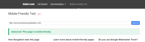
Did Your Website Pass Or Fail?
After running the test linked to above, we now know where your website stands, so let's talk about some actions you can take. There are three types of approaches that pass the test, but good design and an awesome user experience result in only one option for our clients.
1) Responsive Design

This is Google's #1 recomended design. It's also what we use for our clients here at Business Actualization. Responsive means that the code actually adapts to the device screen size. Tablet, PC, Laptop, Phone - same experience, one URL, one copy of the website.
2) Dynamic Serving
As with Responsive, there is one URL but the HTML code changes to build the site for the screen. This can be error prone, but does pass.
3) Mobile Website
This was the earliest type of a mobile website and has long been replaced. This method attempts to determine the users screen size and serve a copy of the website. Two versions to update, two sites for Google to crawl and a disruptive experience for the user.
Mobilegeddon
It's being called mobilegeddon, mobilepocalyse, mopocalypse or mobocalypse. Regardless, it's time to look closely at your website and make a desicion to survive the epic reshuffle of how you may appear on search engine result pages.
Ready to take action? Schedule a consultation with us and we will help you conquer the mobocalypse!